The events that transpired so far this year have made investing a stomach-churning experience. As many investors have seen their portfolio allocation to U.S. stocks increase amid the massive outperformance in 2023 and 2024, rising volatility for the S&P 500 have also directly translated to higher portfolio volatility. The headline-driven market translated to a sharp decline and then rise of stock prices – leaving investors that may have correctly predicted the correction having to chase the market higher, or worse, being left behind completely. On April 9th alone, the S&P 500 was up 9.4% following the announcement of 90-day pause on U.S. tariffs. Fear quickly turned into Greed.
We believe that time in the market – not timing the market – is the best mantra for building long-term wealth. This is the reason that back in April we reminded investors not to make a rash decision amidst the escalating trade war and correction in equity prices. A well-constructed portfolio with adequate diversification and downside protection is built exactly to navigate through this kind of volatile environment with less volatility. As U.S. stocks have rallied sharply since the bottom in April and valuation is now back to near its recent peak, the risk-reward of investing in S&P 500 has deteriorated.
Unlike in 2023 and 2024, diversification outside of U.S. equity and mega-cap tech stocks have paid off so far this year. First, consensus for international stocks’ earnings in 2025 have been revised higher even as analysts are marking down their U.S. earnings estimate (Figure 2). Second, although the starting point of cheap valuation for international and emerging market stocks at the beginning of the year have bolstered their performances, today’s valuation is far from expensive when compared to the S&P 500 on both the headline level and sector-by-sector basis. Third, likely we have entered a multi-year bear cycle of the greenback that makes investing in U.S. assets less attractive on the margin for overseas investors. After accounting for the decline in U.S. dollar against the Canadian Dollar this year, U.S. stocks have underperformed even more relative to its international and emerging markets counterpart (Figure 3).

Meanwhile, allocation to commodities not only improves investors’ total portfolio return, but also reduces its volatility amid lower correlation to equity and fixed income exposure. The Bloomberg commodity index has rallied 11% YTD with copper and gold price up 21% and 28%, respectively. This is much higher than the 2% return delivered by S&P 500 in U.S. dollar terms, as of the time of writing (June 19th).
The geopolitical tension in Middle East has also bolstered the case for commodity exposure as a geopolitical hedge, as the oil market is still highly affected by the development in the region. However, it is important to note that the economic impact of oil price shock today is much lower than in the preceding decades. Figure 4 shows that back in 1975 it takes 2.8 barrel of oil to generate $1 million of U.S. GDP. This figure has declined by 70% by 2023, contributed primarily by rising industrial efficiency, faster growth of the service sectors that are less energy-intensive and the rise of renewable energy.

Historically the longer-term impact of geopolitical shocks tends to be limited. In a world that is less predictable, however, the value of real assets ins increasing compared to its paper counterparts. Gold has outperformed long-term bonds and bitcoin as a hedge asset in the current conflict. Note that gold is now the second largest reserve asset for major central banks, next to U.S. dollar assets. For oil, the spike in price is mostly concentrated in the near-term future contract, with price for next year delivery remain relatively anchored at around $65/bbl. This is partially due to the backdrop of OPEC having around 4.3 million barrel/day of excess capacity that could be brought into production if Iranian crude oil supply is disrupted (Figure 5). However, potentially higher energy cost in the coming months – at a time when goods inflation potentially turns higher amid tariffs – make it harder for the Federal Reserve to cut policy rate.
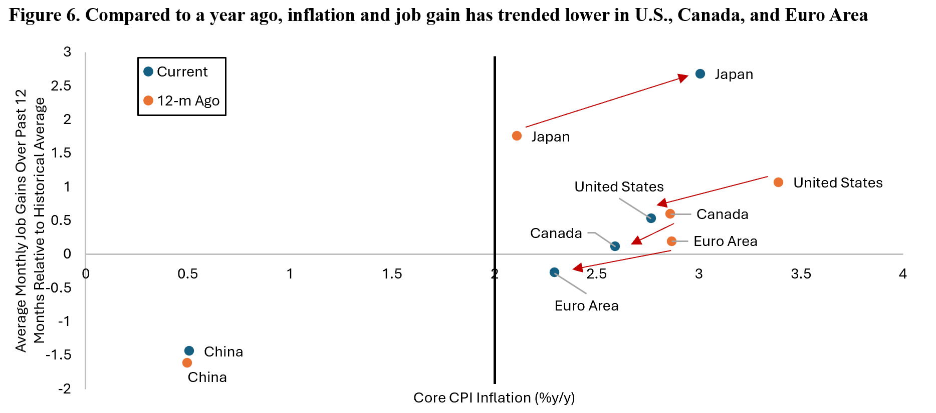
The unpredictable outcome of the war in Middle East and the flip-flop of U.S. trade and fiscal policies makes the job of economists and investment strategists much more difficult as the headline data is often masking the underlying economic picture. What we know for sure is that U.S., Canada, and Euro Area have seen decline in both the pace of job gains and core inflation compared to a year ago (Figure 6). Although the three economies still saw inflation above their respective central bank target, the pace of job gains in the Euro Area has fallen to below historical average level, whereas in Canada it is back to trend and the U.S. is still slightly above. Japan is a special case where both inflation and pace of job gains have accelerated amid the very loose monetary policy and strong domestic growth momentum. Meanwhile, China’s economy remains stuck in a deflationary backdrop despite the recent pick up in retail sales – thanks to government trade-in subsidy – and industrial production.
Zooming further into the U.S. economy, Figure 7 shows the headline and “core” GDP estimate by Atlanta Fed. By stripping out volatile categories such as trade balance and inventory build, we are able to derive a more stable estimate of U.S. domestic demand growth. Currently it is estimated to be around 2.3% q/q annualized, which is roughly in-line with historical trend growth of U.S. economy. This should give comfort for investors following the slight contraction in U.S. GDP number in the first quarter of the year (-0.2% q/q ann.). The number for Q2/25 GDP will likely be stronger as net exports would flip from a headwind into tailwind for the headline GDP growth.

Below the surface, however, we are watching for the crosscurrent in U.S. labour market data that is the Achilles heel of America’s consumer-driven economy. The 3-month moving average of non-farm payroll gains have dropped from 274k at the end of 2022, 199k in 2023, 182k in 2024, and 135k currently. Between 2010 and 2019, the U.S. economy added on average 180k jobs every month. Our point here is that the pace of job creation in the U.S. economy has dropped to below trend level. Moreover, majority of the revisions for non-farm payrolls have been to the downside since 2022, which historically coincided with periods of below-trend GDP growth (Figure 8a). The contrary argument to that is if the labour market is indeed weaker, then how come unemployment rate still hovers around 4.2% and not higher?
Yes, U.S. unemployment rate is still at the same level as in July 2024 at 4.2%, but the number of unemployed people has increased 140.000 since (Figure 8b). The reason the unemployment rate hasn’t changed is due to the decline in labor force participation rate and the increase in flow of people going from employed straight to not in labor force – which arguably understate the number of people who does not have work but may want one.

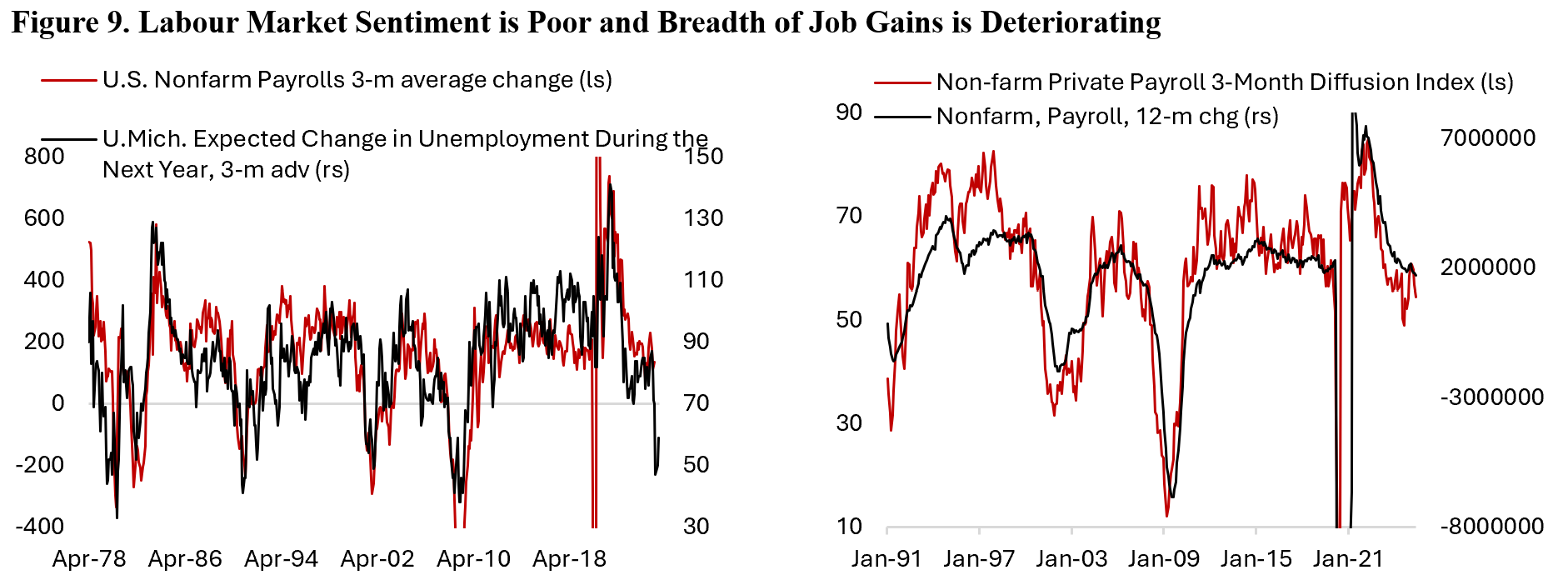
There are few reasons how people could transition from employed to not in labor force, including retirement, going back to school, taking care of family, disability, and discouragement. Although we do not have statistics on these, the latter probably play an outsized contribution to this flow. Figure 9 shows University of Michigan survey highlighting the poor labour market perception among households, with larger share of households think unemployment rate is going rise in the coming year. Historically, this has led the actual change in non-farm payrolls with a one quarter lag. This poor sentiment may partially explain the increase in flow of workers from employed straight to not in labor force. In addition, breadth of job gains is also deteriorating with only 55% of industries reporting net job gains of late – far below the normal range of 60% to 80%. This reinforces our view that U.S. labour market has indeed normalized and probably operating below trend today.
Another factor that may explain the transition outside labor force is the crackdown on illegal immigration by President Trump’s administration. In 2022, around 11 million people is classified as illegal immigrants in the U.S., which represented 3.3% of U.S. population and 23% of the foreign-born population. An estimated 8.3 million of them are either working or looking for work, meaning that they are counted in the labor force calculation by the Bureau of Labor Statistics and represented 4.8% of U.S labor force. California, Texas, Florida, New York, and New Jersey are states with the largest illegal immigrant population.
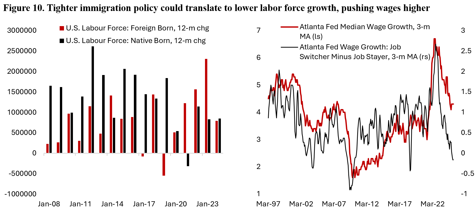
Now that immigration policy is set to be tighter, this could constrain the supply of labor as illegal immigrants shy away from work amid fear of being apprehended and disincentivize illegal immigration itself, which is exactly the goal of current U.S. policy. Construction and agriculture will be impacted more than others as an estimated 14% of its labor force is classified as illegal immigrants, while hospitality (7%) and wholesale trade (6%) likely also see sizeable impact. In an extreme case, illegal immigrants account for half of all hired field and crop workers, making U.S. farming – a sector with high political sensitivity for Republicans – highly dependent on the flow of these immigrants. The bottom line is that U.S. labour force growth will likely be much lower in coming years and potentially translating to a relatively tighter labour market and higher wage growth than otherwise would be the case. Figure 10 shows that the wage growth premium for switching jobs have been eliminated, which marks poor labour market condition, but nominal wage growth today is still running at a level above pre-pandemic average.
The weaker trend in real income growth is also apparent in consumers’ spending data alongside the trend of weaker ISM service PMI. Following the strong U.S. retail sales data in March amid tariffs frontrunning, consumer spending reversed in April and May. We knew that lower-income households have been curtailed their spending since last year as they suffered disproportionately more from higher inflation and borrowing cost, but now there are signs that higher-income households are curbing their spending too. According to high-frequency data based on card transactions, spending on restaurants have slowed to around 2.6% y/y in nominal terms – implying flat growth after adjusting for inflation – while spending on accommodation and air transportation have contracted since early this year.
With that said, the average of American household balance sheet today is in a much better shape compared to fifteen years ago. Middle and high-income consumers are not concerned about their ability to pay their bills as employment have not worsened to the point where their earning capacity is jeopardized. Only those earning less than $50.000 a year are increasingly worried about meeting their debt obligation, which largely contributed to the sharp increase in auto and credit card delinquencies to the highest level since the GFC (Figure 11). This is worrisome given the labour market has not deteriorated markedly.

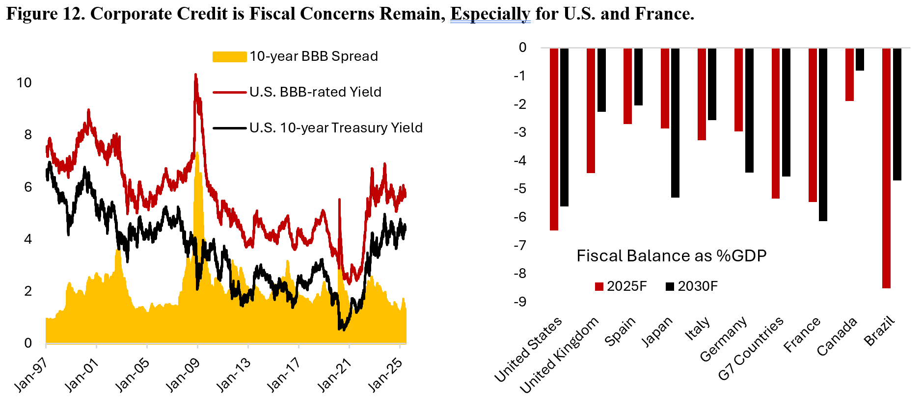
This makes the extension of tax cuts an important driver to sustain the current U.S. economic growth, which has been sustained by loose fiscal policy in recent years. The rounds of fiscal stimulus injected into the U.S. economy since the beginning of the pandemic is akin to a doctor repeatedly giving stimulants to a patient to prevent him from sleeping, which is not without its side effects. The problem is that fiscal dominance – an environment where government’s high level of deficit leaves monetary policy becoming less effective – is now becoming a problem for the bond market with investors asking higher premium for holding long-term bonds. Another way of looking at the tight corporate spread is that the quality of government debt has deteriorated compared to corporate, with the latter trading where it should according to fundamentals (Figure 12). The issue is not isolated for the U.S., but the size of U.S. economy and government debt market makes it more relevant for global investors. Single monetary policy for Eurozone countries means the outlook for French government borrowing rate is even more worrisome, as without reduction in public spending the country will likely see its higher borrowing rate compared to Spain, Portugal, and Greece – countries that were deemed “toxic” during the European debt crisis in 2013.
This led to the question of whether government bonds are still playing the role of safe-haven assets for investors’ portfolio. The answer will depend on each government’s credibility in bringing their finance in order. In the meanwhile, gold and real assets could benefit from potential currency debasement that makes it easier for governments to service their debts. Figure 13 highlights the historical hedging capability of several asset class during equity market correction. Since July 2010, there are 290 days of the S&P 500 falling between 1% and 2%, 85 days of decline between 2% and 3%, and 41 days of decline greater than 3%. U.S. treasury bonds had been the best hedge during severe equity market corrections, with gold standing in the second place. Going forward, however, this may no longer be the case. As the recent escalation in Israel-Iran war shows, the U.S. treasury bonds no longer acts as a hedge assets due to investors increasingly concerned that oil price shock could translate into another bout of inflationary period for the U.S. economy and pushed back the timeline of monetary policy easing.

Investors are also rightly concerned on the correlation breakdown between the U.S. dollar and U.S. government bond yield (Figure 14a). The combination of falling currency and higher bond yields is a problem commonly faced by developing countries’ government and those with weak credit rating – a definition that does not fit the U.S. government. And the longer the high yield environment stays, the longer it will take for rate-sensitive sectors to recover. For instance, mortgage application index is at the lowest in two decades and home builders are increasingly strained amid lackluster demand for new homes given the still high mortgage rate (Figure 14b). This is also a negative for levered firms and certain investment strategies such as buyout, and translating to a rise in inequality as low-income households suffer from higher borrowing cost while high-income households benefit from the increase in coupon yield of fixed income assets. In essence, it’s a transfer from the poor to the rich – a reverse Robinhood effect.

Meanwhile, this trend could also be seen in the equity market where mega-cap tech stocks and cash-rich companies benefitted from the higher interest income whereas smaller-cap stocks with leveraged balance sheet saw their borrowing cost increased. We think it’s highly likely that breadth in the U.S. equity market will improve as long-term yield fall. For the past two and a half years, diversification in U.S. equity market has translated to a worse return for investors as only several mega-cap names drove the bulk of the index returns. This translated to a sharp jump in U.S. equity index concentration. Today, the top 10 stocks in S&P 500 account for around 35% of the index weight – higher than the record of 25% seen during the peak of tech bubble in late 1990s (Figure 15).
It is important to note that the outperformance of market-cap weight index over its equal-weight counterpart was an exception rather than the norm in the past cycle. In fact, smaller-cap stocks tend to outperform in the longer-run and concentration is a double-edge swords as crowded positioning gets unwind during correction. The U.S. is not unique in the sense that its equity market is heavily concentrated in several names; Taiwan, China, South Korea, Brazil, France, and Germany also have more than 50% of its equity market dominated by the top 10 names. However, the U.S. is the only market where the market cap reached trillions of dollars. As impressive as it was to see Apple grew from $300 billion to a $3 trillion company, the bar to continue outperforming the broader market is very high. After all, a company’s profit can’t grow faster than the broader economy forever.

On an aggregate basis, U.S. equity earnings growth expectation is around 12.8% in the next twelve months, but revision will likely tilt to the downside given economic surprises have been lower (Figure 16). The rally we have seen since April has been fueled primarily by multiple expansion rather than earnings, which is probably not surprising given liquidity indicators are still close to neutral and supportive of equity multiples (Figure 17).

The bottom line is that inflation and labour market conditions have returned to trend in the U.S., Canada, and Euro Area – the reason monetary policy should continue to be tilted towards the dovish side in the coming quarters. Uncertainties related to U.S. tariffs and tax policies linger even as risk assets continue to march higher.
We think the U.S. economy is still in a late cycle environment where downside risks continued to accumulate, and investors would do well to rebalance their portfolio – taking the gains from recent winners and reallocating that to laggards with potential to catch up – in anticipation of a mean-reversion in the market.
Copyright © 2025, Putamen Capital. All rights reserved.
The information, recommendations, analysis and research materials presented in this document are provided for information purposes only and should not be considered or used as an offer or solicitation to sell or buy financial securities or other financial instruments or products, nor to constitute any advice or recommendation with respect to such securities, financial instruments or products. The text, images and other materials contained or displayed on any Putamen Capital products, services, reports, emails or website are proprietary to Putamen Capital and should not be circulated without the expressed authorization of Putamen Capital. Any use of graphs, text or other material from this report by the recipient must acknowledge Putamen Capital as the source and requires advance authorization. Putamen Capital relies on a variety of data providers for economic and financial market information. The data used in this publication may have been obtained from a variety of sources including Bloomberg, Macrobond, CEIC, Choice, MSCI, BofA Merrill Lynch and JP Morgan. The data used, or referred to, in this report are judged to be reliable, but Putamen Capital cannot be held responsible for the accuracy of data used herein.
