Over the past two years we have seen diverging takeaways from various macroeconomic indicators that worked well in the past. Indicators of consumer sentiment are downbeat, but overall consumer spending has been strong. In the Canadian province where I currently live, Ontario, slightly over one million people visited a food bank between April 2023 and March 2024 – a 25% increase compared to the previous year – according to Feed Ontario. These one million people visited food banks 7.6 million times during the period, a 134% rise compared to the pre-pandemic level. Meanwhile in the U.S., earlier in May CNN reported that food banks saw an increasing visits from working American families. U.S. Census Bureau’s Household Pulse Survey showed that one in ten adults lived in households where there was not enough food to eat over the past week. How could one reconcile this with the fact that U.S. real GDP grew at a robust rate and consumer spending roared following the pandemic?
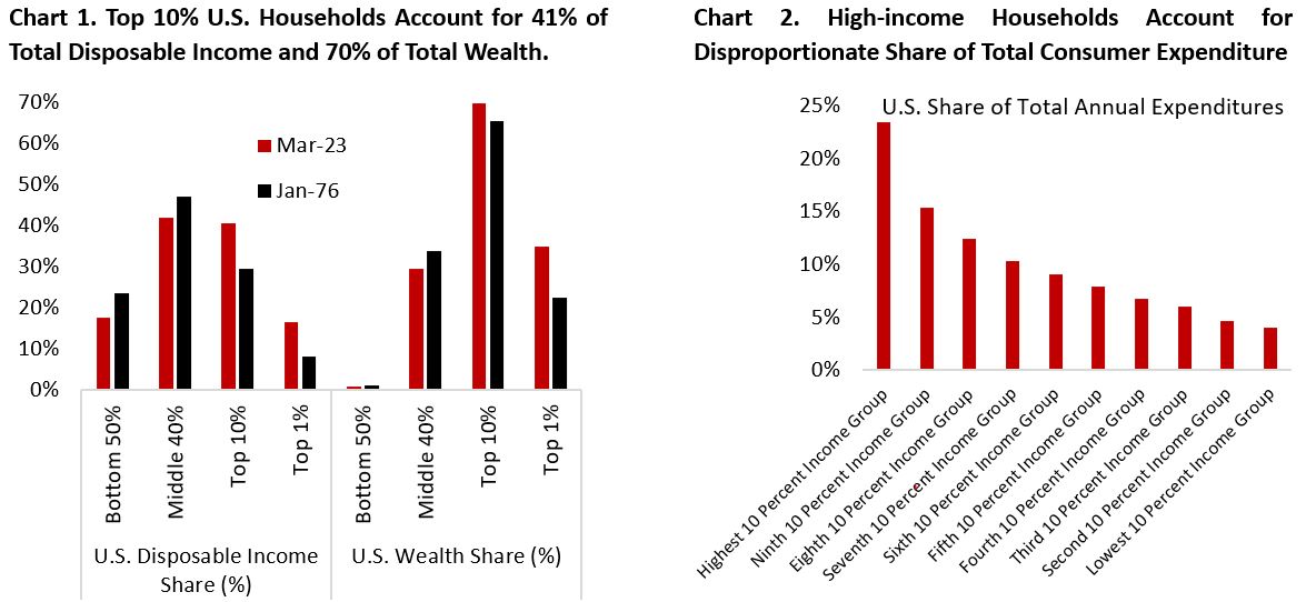
To start, we need to understand that the aggregate numbers commonly watched by economists and investors mask the underlying pictures across income group. Chart 1 shows that the top 1% households own 35% of the wealth in U.S., an increase from 23% in 1976, and the bottom 50% households barely have anything to show. As a share of disposable income, the bottom 50% households have also seen their income share declining from 23% in 1986 to 18% currently. In fact, the decline in income share could also be seen in the middle 40% households.
Given the increasing concentration of income and wealth in the hand of top 10% households, it is not surprising that we see similar skew in consumer spending by the high-income consumers. Chart 2 shows that the bottom 50th percentile households accounts for only 30% of total consumer expenditure and the top 30th percentile contributing to half of total consumer spending. The composition of consumer spending that is dominated by higher-income households and consumer sentiment that is more representative of how the median consumer feels explain the divergence we have seen between spending and sentiment following the pandemic. Recent Fed survey shows that real spending for the top quintile income continue to grow at a healthy rate, but those of the two bottom quintiles have been flat since 2022.
Focusing on the bottom 20th percentile households by income, the data shows that this group spent disproportionately more on food and housing as a share of their pre-tax income (Chart 3). In fact, food and housing expenditures total more than their income – suggesting the reliance on government support and borrowing. Interestingly, the upper-middle class on the 60-80th income quintile spent an average of 63% of their pre-tax income on these necessities, a higher proportion compared to the two income groups below this category. Perhaps as households’ income increases, they tend to also consume higher quality foods and live in better dwelling, making the upper-middle class the most vulnerable to the spike in food and shelter inflation seen post-pandemic, next to the lowest income group. Since the pandemic began, rents and food prices have increased 25.7% and 26.6%, respectively, higher than the overall headline inflation of 21.7% (Chart 4).

The different consumption basket of each income group means they have different inflation experience in the last three years. In sum, inflation for the lowest income group of households is much higher than suggested by the commonly watched headline CPI figure. This explains why workers with income below $50.000 annually expect inflation in the next one year to be around 5.2%, whereas workers earning $50-100k and above $100k expect inflation to be much lower at 2.8% and 2.3%, respectively, not far from the Fed’s inflation target (Chart 5).

The difficulties for lower-income households are further compounded by the weaker job outlook for jobs paying $50.000 and below (Chart 6). Take the perspective of someone in the low-income group: your real income growth has been stagnating for years, you don’t have much wealth invested in equities so likely you are missing the boom in asset prices. Higher interest rate seen over the past two years mean your interest burden is rising fast, likely forcing you to reduce consumption or rack up credit card debt – further increasing the financial burden from higher borrowing cost and rising debt balance. Meanwhile, your employment outlook is becoming more uncertain. Gone are the days when there are plenty of opportunities to switch jobs and gain material increase in wages. Simply put, consumers in the lower income group have suffered more from inflation, higher borrowing cost, and normalization in the job market. It is perhaps not surprising that consumer sentiment and expected personal financial situation for the bottom and middle-third income households are nearing the pandemic low even as those of the top-third income recovered over the past four years (Chart 7).

Depending on who you asked, it is the best and worst of time. If you are fortunate enough to be in the high-income bracket, you should be feeling really good right now. House prices and the stock market are near all-time-high, and probably your equity portfolio too. For most Americans, owning a home is the key to entering the middle-income class (Chart 8). For renters, elevated shelter inflation has been hurting your personal finance, but for homeowners the increase in house price means wealth gains. Given that most mortgage in the U.S. is structured as 30-year fixed, most homeowners barely felt the increase in borrowing rate amid Fed policy rate hikes. On the contrary, the cash that sits in your bank account and historically earned close to nothing is now yielding extra monthly income in your bank accounts. You may decide to spend a portion of it for discretionary spending (travel, luxury goods, renovate home, etc.), and invest the rest.

The cycle of inequality is further perpetuated by the inter-generational wealth that is being transferred from older to younger generation. Adjusting for the age difference, household wealth is increasingly in the hands of millennials. Chart 9 shows that Millennials own $15.2 Tn of wealth, Gen X $39.6 Tn, and Baby Boomer 79.9 Tn. Adjusting for the life cycle, millennials’ wealth (green line) is tracking their predecessors.
Although the lowest-income consumers have suffered most, we need to keep in mind that it is the middle-class consumers that spent the highest share of their income on necessities (Chart 3). These are people who have decent education background and constitute the bulk of the working class – the backbone of economies around the world. And increasingly they are feeling left behind and that government policies are not effective in improving their life. Chart 10 shows that before the pandemic, consumer opinion on government’s economic policy for both the top-third and middle-third income group tend to move together. Post-pandemic, however, the former has been moving closer in-line with the bottom-third income group instead. In sum, the middle class – a large share of voters – is increasingly disenchanted by governments’ economic policy.
Arguably, this has translated to the U.S. politics we see today that helped Trump win the 2024 U.S. presidential election. It’s certainly difficult to argue that the system is working well when the average family feels their living condition has deteriorated. And instead of supporting a policy agenda for one party or another, voters are increasingly voting based on which party they dislike more. High inflation under President Biden’s administration hit the lower and middle-class consumers hard. With the economy on top of mind for most voters, this helps the Republican party to take over the presidency and Senate. Chart 11 shows that consumer sentiment among Republican party supporters is at a level similar to during the depth of the pandemic.

As voters feel their own quality of life being threatened, they increasingly want their elected representative to also focus on domestic priorities rather than overseas development, whether it is Middle East, Taiwan, or Russia. This brings us back to the famous “Long Telegram” doctrine written by George Kennan, an American diplomat in Moscow in 1947, describing two tasks for American foreign policy. First, America needed to check and contain Soviet aggression on every continent. Second, it needed to avoid crippling social and political divisions at home, and to show other countries that America was coping with “the responsibilities of a world power”.
As mentioned earlier, the normalization of the labour market is also weighing on consumer sentiment for the bottom-third income group (Chart 6). Job opening rate for many sectors, has fully normalized and even fall to below pre-pandemic level (Chart 12). Currently we are still in the low hiring, low firing environment (Chart 13). But historically it doesn’t take long before this turns into a low hiring, high firing one.

On the flipside, corporate sector should continue to enjoy the tailwind from potentially lower tax under Trump’s presidency. Over the past three decades, the share of corporate profit as a share of the economy has consistently risen from 9% in 1990 to 15% currently (Chart 14). Two factors have helped this trend: structurally lower borrowing cost (1990-2020) and lower taxes. During this period, corporate tax rate in the U.S. declined from 34% to 21%. Trump’s agenda to cut corporate tax rate further to 15% likely mean corporate profit share will continue to increase under his term. On the other hand, the share of labour compensation has declined to 62% from 67% in the 1990s. Interestingly, workers’ share continued to fall despite the elevated wage inflation seen post-pandemic.

Across the Atlantic Ocean, the situation is worse for manufacturing-dependent European economies amid the competition from China and Southeast Asian countries. Up until the last few years, Germany and Eastern European countries have been a strong base of global auto manufacturing sector. Declining productivity trend, higher energy prices from the impact of Ukraine-Russia war, and shift towards electric vehicle have all become headwinds for the continent. Not only European auto producers are facing stiff competition in mainland China, a major market, but they are also increasingly losing market share at home.
The challenge for U.S. natural allies is further compounded by Trump’s victory, which would likely mean more erratic policy announcements and higher market volatility. Under “America First” policy, Europe, Japan, Taiwan will have to rely more on their own with regards to defense policy and reduce their dependence on goods exports to the U.S., the world’s largest consumer economy. A very negative equity market reaction to Trump’s policy, however, should limit radically negative policies from being implemented – as we had seen during Trump’s first presidency.
A larger fiscal deficit under Trump’s presidency mean the U.S. economy may be able to sustain its GDP growth rate above trend but is potentially problematic for the trajectory of inflation. The market is certainly paying attention to this risk, with long-term bond yield moving sharply higher as the odds of Trump Presidency increases. Higher borrowing rate, however, has the secondary effect of hindering the recovery in U.S. manufacturing sector, which is relatively weak currently and reflective of the malaise among smaller businesses. Chart 15 highlights the relationship between the outperformance of equal-weight S&P 500 over the market-weight counterpart against U.S. ISM manufacturing PMI. Simply put, a broadening in U.S. equity market rally would need a rebound in the business cycle and higher yields could slow the recovery.

Based on traditional valuation metrics, the U.S. equity market remains expensive, although we acknowledge the sector composition have shifted dramatically towards tech in the recent decade and earnings may continue to grow low teens next year. Digging into sector-level valuation, only one sector – energy – is trading below the historical median forward P/E ratio. Chart 16 plots each sector forward P/E ratio against next year’s EPS growth estimate. On the index level, S&P 500 companies are expected to grow their top line by around 6% in 2025 and margin to slightly expand. Meanwhile, the contribution of Magnificent-7 stocks’ earnings growth should continue to fall and converge to the rest of the index (Chart 17).

Small-cap stocks have rallied hard the day after Trump’s victory. In our view, this outperformance is unlikely to sustain in if bond yields again march higher. The diverging fate between the “have” and the “have not” is not only visible among low and high-income consumers, but also among companies. Companies with cash-rich balance sheet enjoyed higher interest income, but those with higher net debt profile have or will soon see their borrowing cost balloon. Chart 17 shows that Russell 2000 Index (small cap) and equal-weight S&P 500 have lagged the market-cap-weight S&P 500 since the Fed’s rate hike in 2022.
Given the shift of middle-market borrowing from banks and the high-yield market to private credit players, it is perhaps private equity and private credit investors who will take the hit. Already we are seeing increasing share of companies (around 14%) who borrowed from credit player opting to Payment-In-Kind (PIK) structure – most of them due to inability paying their interest expense by cash.

Copyright © 2024, Putamen Capital. All rights reserved.
The information, recommendations, analysis and research materials presented in this document are provided for information purposes only and should not be considered or used as an offer or solicitation to sell or buy financial securities or other financial instruments or products, nor to constitute any advice or recommendation with respect to such securities, financial instruments or products. The text, images and other materials contained or displayed on any Putamen Capital products, services, reports, emails or website are proprietary to Putamen Capital and should not be circulated without the expressed authorization of Putamen Capital. Any use of graphs, text or other material from this report by the recipient must acknowledge Putamen Capital as the source and requires advance authorization. Putamen Capital relies on a variety of data providers for economic and financial market information. The data used in this publication may have been obtained from a variety of sources including Bloomberg, Macrobond, CEIC, Choice, MSCI, BofA Merrill Lynch and JP Morgan. The data used, or referred to, in this report are judged to be reliable, but Putamen Capital cannot be held responsible for the accuracy of data used herein.
